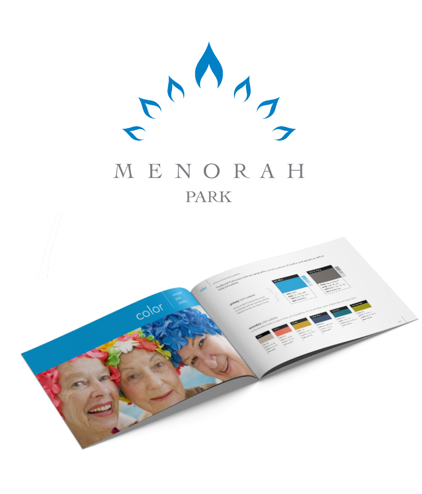
Menorah Park asked FORM to re-design their brand and online presence to better communicate their exceptional services, high quality of care, and vibrant campus lifestyle.
One of the most substantial nursing home and assisted/independent living campuses in Ohio, Menorah Park is unique among its kind. It provides an exceptionally active environment in which seniors can engage rather than “slow down.”
Project Scope
- Identity Design
- Brand Guide
- Stationery, Brochure, Magazine Design
- Website Design (Information Strategy, Visual Design, Production)
- Website Content Management System
- Sub-brand Identity Design, Color Treatments + Stationery
- Photoshoot
An active logo for an active lifestyle
Because Menorah Park is a large institution with many disparate stakeholders, prospects, and clients, we knew the new logo would have to speak effectively to all of these audiences. The existing logo had been in use for decades and was loved by many, but it was inherently difficult to reproduce and was not reflective of the vitality of this lively campus. Making the task still more complex, we knew the new logo design must pay homage to the organization's Jewish heritage while not alienating prospective clients of various faiths. All of these factors made it especially important to approach the new brand with sensitivity and care.

To arrive at the core concept behind the new logo, our design team researched the menorah as a symbol as well as its origin and meaning throughout history. This research led us to pursue a logo concept that would retain the spirit of the menorah while also holding universal appeal.
We designed the new mark with shapes reminiscent of menorah flames in a radiating configuration. The shapes were designed to "move" with vitality. We incorporated a sense of air and used classic typography to create a tone of dignity, history, stability, and respect. We reinvigorated the brand with a brightened, energetic blue. The color, while significantly more vibrant than the previous logo, seemed like an evolution rather than a revolution, making it a comfortable transition for fans of the old identity.

Once the new identity was established, we went on to develop sub-branded treatments for the various residences and levels of care on campus. Before the rebrand, each residence had its own identity, which caused confusion for prospective residents. We brought them together as a unified family of properties, using color to distinguish one from the other.
Another critical element of the rebranding was to help the organization build a library of authentic, professional photography. We guided photographers with art direction, tone and content notes to ensure the images shared a cohesive tone and focused on certain types of subject matter. Now equipped with an extensive catalog of imagery, the organization can easily use visual storytelling as a critical aspect of their branding and communications.
Expressing excellence through the web
Our information strategy and overall visual design for the Menorah Park website was to create a welcoming, clear, and easy-to-navigate online presence. This goal was particularly important for Menorah Park because their prospects and web visitors are often emotionally overwhelmed when they arrive at the site, so clear labeling and language was critical. We knew it would be essential to provide peace-of-mind for visitors, too, by offering help and answers at every turn. We relied heavily on photography to tell the story of Menorah Park's exceptional lifestyle and quality of care.
Often, large organizations develop something of a blind spot for telling their own story and tend to organize their websites based on an internal structure rather than what makes sense to users. At Menorah Park, this problem was made more complicated because each group within the organization was accustomed to brand autonomy. So, to create a frictionless rebrand and web build, FORM worked closely with all the internal stakeholders of Menorah Park to guide them through a dialogue, listen to their concerns, and help them come together around a shared vision.
The cohesive redesign and deployment of vibrant new branding, web and print materials marked a significant sea change for Menorah Park. Their donations, website leads, and visibility has dramatically improved. See more of our work for Menorah Park in our case study.
Contact us to learn how we can help revitalize your brand and web presence.